
Why a Website Should Feel More Like a Magazine
The best websites don’t simply give us information. They give us a reason to stay.
We live in a world designed to make us move quickly.
Scroll. Click. Swipe. Continue.
Websites have learned to compete for our attention in much the same way: more movement, more messaging, more calls to action, more information packed into every available space.
But magazines — ones with beautiful design, white space, intentional typography.
You slow down.
A photograph is allowed to occupy an entire page. A sentence might stand alone. One story unfolds over several spreads. There are places where very little happens at all.
And somehow, rather than making us impatient, all that space makes us want to keep turning the pages.
That's the experience a thoughtful website can create, as well.
A Website Can Be More Than a Brochure
For years, business websites have largely been treated as digital brochures.
Tell people who you are.
Explain what you offer.
Show a few examples.
Ask them to contact you.
All of those things are necessary. But they're also only the information a website contains—not the experience it creates.
Editorial design asks a different question:
What if your website wasn't simply something people used, but something they experienced?
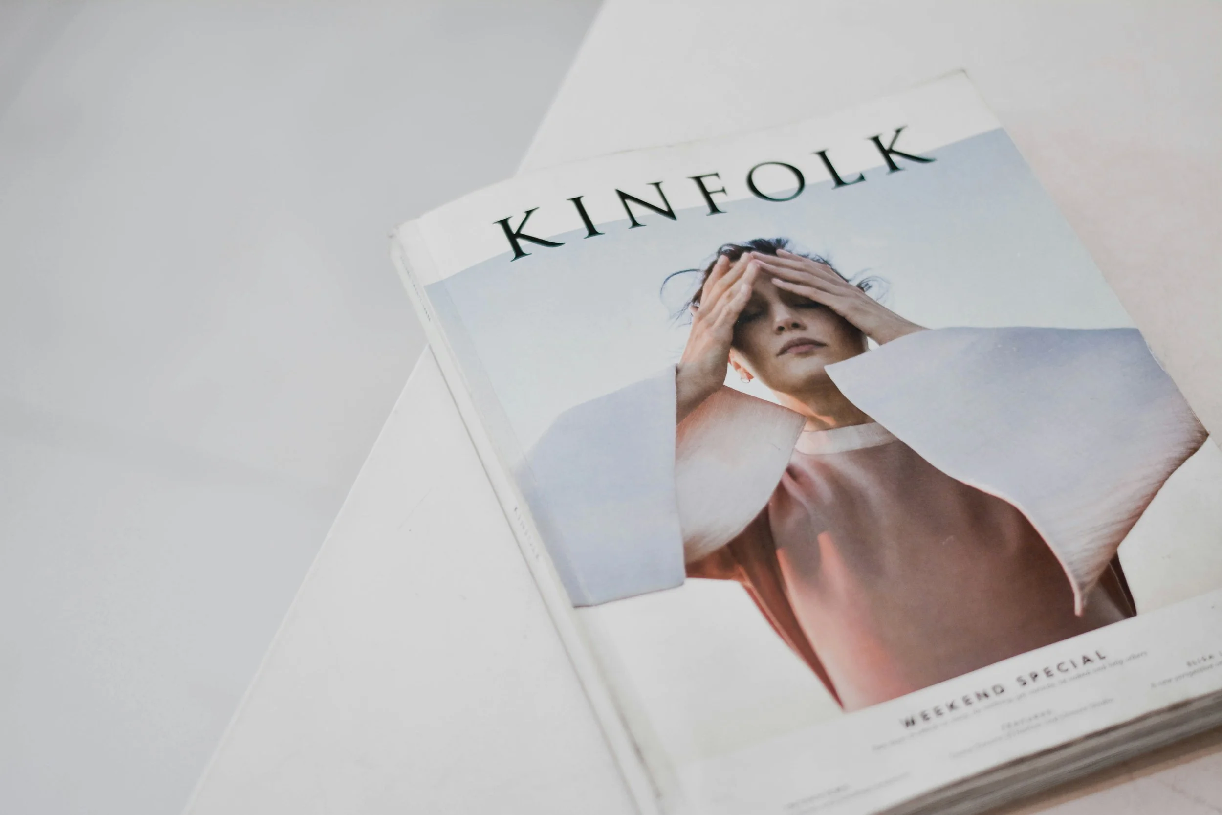
A magazine cover is nearly empty, and because of that, it creates curiosity.
It establishes a point of view. It uses photography, typography, words, scale, and space to guide us through a story. Some pages give us information. Others create emotion. And each turn of the page gives us a reason to discover what comes next.
Websites can do the same.
Good design doesn't demand attention. It creates the space for attention to happen naturally.
Give the Important Things Room to Matter
Editorial design begins with editing.
Rather than asking What else can we add?, we ask:
What deserves attention here?
That might mean allowing one beautiful photograph to fill the screen instead of placing six in a grid.
It might mean giving one sentence generous space rather than surrounding it with three more paragraphs.
It might mean showing five extraordinary projects instead of every project you've ever completed.
It might even mean leaving an area intentionally empty.
Because white space isn't unfinished space.
It's part of the composition.
It creates hierarchy. It slows the eye. It separates ideas. It allows one thought to land before another begins.
Just as a beautifully designed room doesn't need something on every wall or surface, a beautifully designed website doesn't need to fill every available inch.
Sometimes restraint is what allows the things you've chosen to become memorable.
Let Photography Tell Part of the Story
Magazines understand something websites often forget:
Not every image needs to explain something.
Some photographs provide evidence.
Some create connection.
Some reveal details.
Some establish atmosphere.
And some simply give us a moment to pause.
That's why editorial websites often use photography at a generous scale. A small photograph gives us information; a large one invites us in.
We notice expression. Texture. Light. Movement. Environment.
We begin to feel something before we've read another word.
Photography stops being decoration around the content and becomes part of the content itself.
Create Rhythm, Not Just Sections
There's also a rhythm to good editorial design.
Large, then small.
Dense, then open.
Words, then image.
Story, then pause.
A long passage followed by a single sentence.
A full-screen photograph followed by a quiet detail.
When every section of a website follows the same formula—headline, paragraph, image, button—the experience can become predictable, no matter how beautiful the individual pieces are.
A magazine changes pace.
A thoughtful website should, too.
We like to think less about stacking sections and more about composing pages.
Not everything needs the same weight. Not everything needs to perform the same job. And not every moment needs to ask the visitor to do something.
Sometimes it's enough to let them linger.
Tell Stories, Not Just Facts
Perhaps most importantly, magazines remind us that people are interested in stories.
Your website certainly needs facts: what you offer, how you work, what someone can expect, and how to get started.
But facts alone rarely create connection.
Stories reveal the thinking behind the work.
They give context to beautiful photographs. They make expertise visible. They help us understand not only what a business does, but what it notices, values, and believes.
That's why we believe a portfolio deserves more than a gallery.
An About page deserves more than a résumé.
A Journal deserves to be more than an SEO strategy.
And a Homepage doesn't need to tell the entire story—it simply needs to make us want to turn the page.
A Quieter Way to Build Trust
None of this means a website should be difficult to use.
Quite the opposite.
Good editorial design creates clarity.
We should always know where we are, what matters, and where we might go next.
But clarity doesn't require constant persuasion.
You don't need another button after every paragraph. You don't need to repeat the same promise six different ways. You don't need to prove everything about your business in the first thirty seconds.
You can trust the reader a little more.
And in doing so, something interesting happens.
The website begins to feel more confident.
More considered.
More human.
Less like something trying to capture our attention—and more like something worthy of it.
This Is the Idea Behind the Editorial Collection
We don't believe every website should look like a magazine.
Editorial design isn't a particular font, a neutral color palette, or a minimalist aesthetic.
It's a way of thinking.
Edit thoughtfully.
Give important things room.
Create hierarchy.
Use photography with intention.
Say something worth saying.
Tell stories.
Create a journey worth following.
The result can look entirely different from one business to another.
But the underlying philosophy remains the same.
Because your website doesn't need to tell people everything at once.
It needs to help them understand what matters—and give them a reason to stay long enough to discover the rest.